# copied via datapasta
responses <-
tibble::tribble(
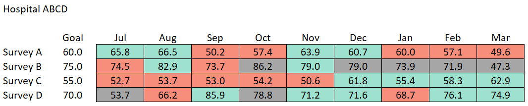
~survey, ~goal, ~month, ~score, ~n,
"Survey A", 60L, "Jul", 65.8, 277,
"Survey A", 60L, "Aug", 66.5, 264,
"Survey A", 60L, "Sep", 50.2, 279,
"Survey A", 60L, "Oct", 57.4, 287,
"Survey A", 60L, "Nov", 63.9, 265,
"Survey A", 60L, "Dec", 60.7, 270,
"Survey A", 60L, "Jan", 60, 263,
"Survey A", 60L, "Feb", 57.1, 281,
"Survey A", 60L, "Mar", 49.6, 267,
"Survey B", 75L, "Jul", 74.5, 35,
"Survey B", 75L, "Aug", 82.9, 32,
"Survey B", 75L, "Sep", 73.7, 39,
"Survey B", 75L, "Oct", 86.2, 27,
"Survey B", 75L, "Nov", 79, 31,
"Survey B", 75L, "Dec", 79, 26,
"Survey B", 75L, "Jan", 73.9, 29,
"Survey B", 75L, "Feb", 71.9, 20,
"Survey B", 75L, "Mar", 47.3, 26,
"Survey C", 55L, "Jul", 52.7, 73,
"Survey C", 55L, "Aug", 53.7, 96,
"Survey C", 55L, "Sep", 53, 81,
"Survey C", 55L, "Oct", 54.2, 99,
"Survey C", 55L, "Nov", 50.6, 85,
"Survey C", 55L, "Dec", 61.8, 83,
"Survey C", 55L, "Jan", 55.4, 97,
"Survey C", 55L, "Feb", 58.3, 82,
"Survey C", 55L, "Mar", 62.9, 83,
"Survey D", 70L, "Jul", 53.7, 29,
"Survey D", 70L, "Aug", 66.2, 38,
"Survey D", 70L, "Sep", 85.9, 36,
"Survey D", 70L, "Oct", 78.8, 28,
"Survey D", 70L, "Nov", 71.2, 32,
"Survey D", 70L, "Dec", 71.6, 38,
"Survey D", 70L, "Jan", 68.7, 39,
"Survey D", 70L, "Feb", 76.1, 37,
"Survey D", 70L, "Mar", 74.9, 36
)
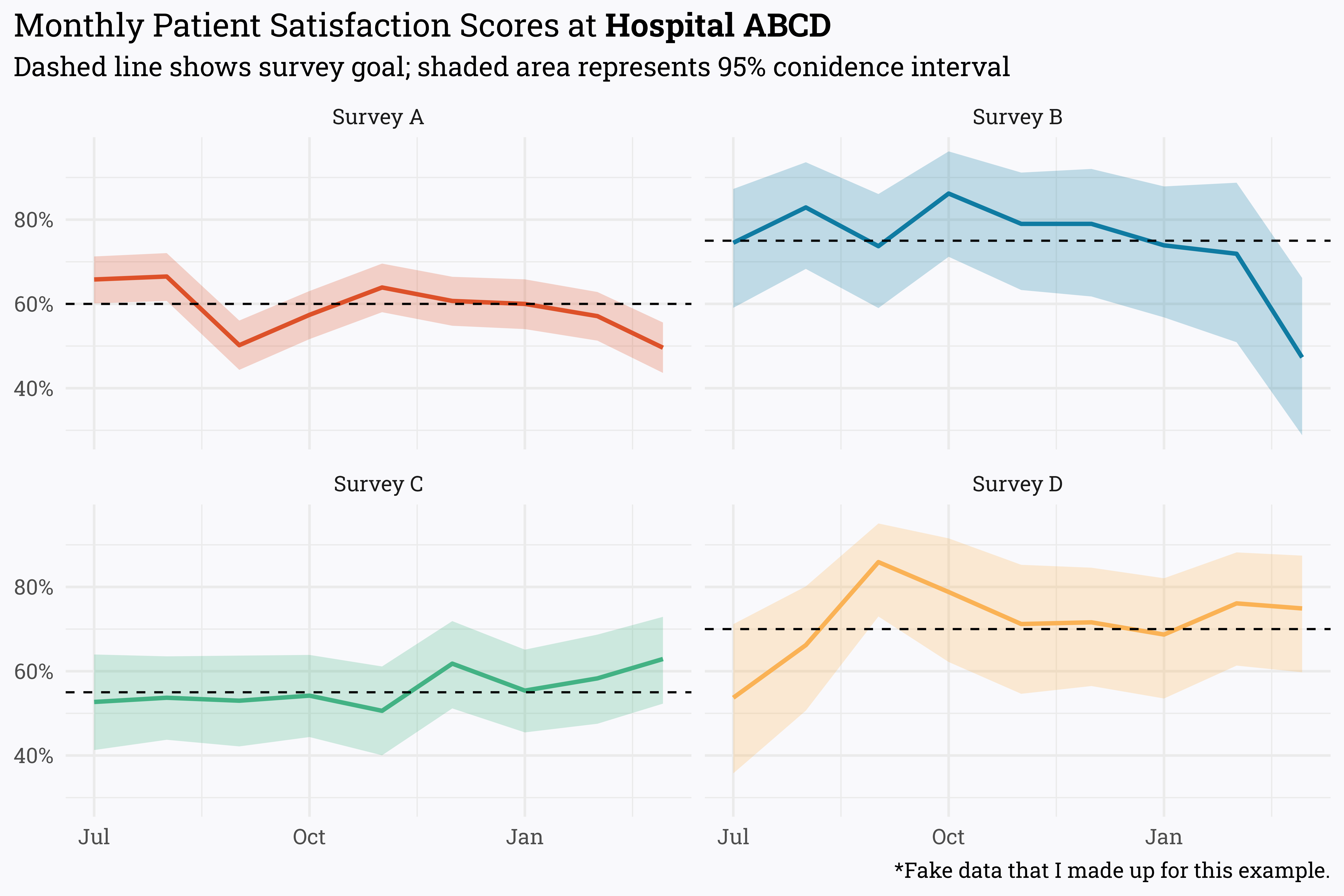
responses %>%
mutate(month = paste(month, "1st, 2022"),
month = lubridate::mdy(month),
month = lubridate::month(month),
month = case_when(month < 7 ~ paste("2022", month, "1", sep = "-"),
month > 6 ~ paste("2021", month, "1", sep = "-")),
month = lubridate::ymd(month),
score = score/100,
alpha = score * n,
beta = n - alpha) %>%
riekelib::beta_interval(alpha, beta) %>%
ggplot(aes(x = month,
y = score,
ymin = ci_lower,
ymax = ci_upper,
color = survey,
fill = survey)) +
geom_ribbon(alpha = 0.25,
color = NA) +
geom_line(size = 1) +
geom_hline(aes(yintercept = goal/100),
linetype = "dashed") +
facet_wrap(~survey) +
labs(title = "Monthly Patient Satisfaction Scores at **Hospital ABCD**",
subtitle = "Dashed line shows survey goal; shaded area represents 95% conidence interval",
x = NULL,
y = NULL,
caption = "*Fake data that I made up for this example.") +
scale_y_continuous(labels = scales::label_percent()) +
MetBrewer::scale_color_met_d("Egypt") +
MetBrewer::scale_fill_met_d("Egypt") +
theme(legend.position = "none")